Blog Pages

Saturday, January 30, 2021

ANOTHER "TWISTED HEART" QUILT (WALL-HANGING)

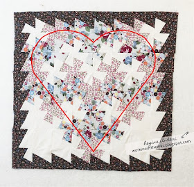
Since my first Twisted Heart wall-hanging didn't show the heart shape very well--and because I really enjoyed the process of making it--I decided to make another one.  For this one, I used a smaller pattern and, when all of the blocks were sewn together and the borders had been added, the project looked like this:


Normally, after having a quilt top such as the one above, it would be ready for a backing, batting, and quilting to make it a complete project.  But . . . with a twister quilt, the above project needs to be cut up in a twisted fashion (block by block) and sewn back together.  For this process, I again used this Twist n Stitch Ruler and this rotary cutter to cut new blocks from the quilt top, arranged them in the same order as the original top (pictured above), and sewed them together.  A backing and batting were added, and following is what the wall-hanging looked like when I finished hand-quilting it:


I was ecstatic to see that the heart shape was very easy to see!  

In case you're interested in the fabric:  Moda Fabrics - Apricot & Ash by Corey Yoder plus a few pieces of muslin.

I kept the quilting simple by stitching near each seam, mainly because I really didn't know another way to quilt it.  My sweet grandmother, who would be so happy to see that I have finally taken a liking to sewing/quilting, would most likely say that I quilted it to death.  She would actually be correct.


Pictured above is the finished wall-hanging displayed on my design board.  My mother and sister helped (and taught) me how to sew the binding on today, and I was amazed at what a quick process that was.  A couple of months ago, I finished a large quilt for my son and dearly hated hand-sewing the binding all around that quilt!  In the end, it looked really nice . . . but I think the binding on my Twisted Heart wall-hanging looks pretty spiffy, too--and it didn't cause me to say ugly words.  Following is another photo (not great, though) on a dark background that better shows the colors in this project:


The thing about twister quilts is that they have a really interesting appearance with their design seemingly made up of pinwheel shapes, and I think they are really fun to make.  I'm just a tad addicted to them, even though the process involves cutting up the first quilt top after cutting, arranging, and sewing the blocks together.  It seems ridiculously destructive, but it's all worthwhile.  I have another--much larger--twister project ready to start, and there are almost 190 blocks that will be cut with this Tiny Twister Tool.  I'm a bit nervous about it because there are so many blocks AND because they will each be a whopping 2-1/4" square.  It will be a patriotic project, and I do love a patriotic project!  Wish me luck!  


Friday, January 29, 2021

"FRIENDS ARE LIKE SEASHELLS"


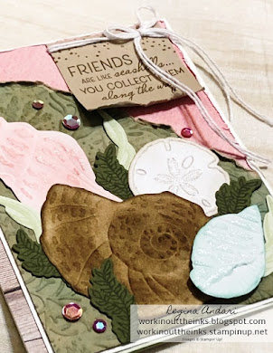
What a beautiful product bundle Friends are like Seashells is . . . and it's got a few clever tricks, too.  But first . . . just take a moment to enjoy all of the colors, glimmer, dimension, and texture on this card.


Creating this card was the first time I have worked with some of the coordinating products in the Sand & Sea Suite and was amazed to discover so many creative options!  Following are the products featured on my card:


Take a moment to appreciate the sentiments in the stamp set.  
Aren't they great?


Notice that big image with shell shapes (try saying that a few times) in the above photo of the dies?  It coordinates with images from the stamp set AND the embossing folder.  How genius is that?!?!  You can die-cut stamped AND embossed images.  On my card, I embossed a piece of white cardstock, cut out the three shells, and then used Sponge Daubers to color them with Blushing Bride, Pool Party, Crumb Cake, and Soft Suede ink.  I then brushed a couple of them with Wink of Stella.  The sand dollar image was stamped with Sahara Sand ink, and I used a Sponge Dauber to lightly ink the edges of the die-cut shape.  The leafy images were stamped with Soft Sea Foam ink onto Soft Sea Foam cardstock and Mossy Meadow ink onto Mossy Meadow cardstock.  But let's talk about the layers with torn edges.


The embossed layer just beneath the die-cut shells was a piece of Crumb Cake cardstock, but I used Stampin' Up!'s new Blending Brushes to apply light strokes of Soft Suede and Pool Party ink to the embossed areas.  Unlike sponges or daubers, when you need/want just a hint of color that won't overtake your project, you NEED the Blending Brushes!  They are fantastic tools, and they absolutely work differently than sponges, daubers, and Sponge Brayers--but with just as much purpose.  FYI . . . in case you're wondering if you'd have to own a Blending Brush for each and every color, the answer is no!  Remember how easy it is to clean Blender Pens and Water Painters by swiping them on a scrap of paper until there's no trace of color?  That's pretty much all you need to do with the Blending Brushes.  I would, however, be mindful to designate the three Blending Brushes to light, medium, and dark colors because touching a wet ink pad could re-activate the ink that remains (stains) the bristles.  I haven't had that issue yet--I'm only mentioning that it might could be possible.  Personally, I have Blending Brushes designated for color groups (yellow, red, green, blue, etc.), and that's working perfectly for me.


The last thing that I want to mention are the Artistry Bloom Sequins on my card.  Can you see how light reflects different colors on them?  I just adore that!  All five sequins on my card are actually the same color, and I am in love with the various colors that they present.  I also love that they come with an adhesive back, so you just have to lift them from the liner and place them where you want them.  

I don't think I clarified that the pink designer paper with the distressed edges is from the Sand & Sea collection, and the wooden pattern on the left edge of the card is from the In Good Taste collection.


What do you think?  Are you in love with this fantastic product suite, too?


Wednesday, January 27, 2021

"SWEET STRAWBERRY"


Who needs a strawberry stamp set, right?  

That's what I thought when I first laid eyes on Stampin' Up!'s Sweet Strawberry stamp set, coordinating punch, and Berry Delightful designer paper (Sale-a-Bration product).  I mean . . . I barely gave the stamp set and punch more than a glimpse!  But . . . each time I flipped the pages of the mini catalog, I found myself spending more and more time on page 44.  There was no denying that the stamp set appeared to have included every imaginable image, and what's not to love about the punches that coordinate with this lovely product?  The Berry Delightful designer paper is soooooo gorgeous and perfect, and I am pacing myself being careful to not use it all too quickly.  

"Sweet Strawberry" stamp set images


These lovely berry products are the ones I've used the most this year--so far.  Yes, I've been mailing strawberry cards in January.  I find them so pleasing and . . . sweet.  

Ready to see the full card that's the star of this blog post?  Here you go:


Other Stampin' Up! products featured on my card that have not yet been mentioned are the Baker's twine from the Snail Mail Twine Combo Pack (#154579 in the mini catalog), Red Rhinestone Basic Jewels (#146924 in the main catalog), Tasteful Textile 3D embossing folder (#152718 in the main catalog), and Stampin' Dimensionals

Pretty sweet, huh?

Thursday, January 21, 2021

"DRAGONFLY GARDEN" FLOATING GATE FOLD CARD


It may still be winter, but is there ever a bad time to play with flowers?  Stampin' Up!'s brand new Dragonfly Garden stamp set is so pretty, and I couldn't resist using it and Flower & Field designer paper on this birthday card for my friend, Laura.


It's a fun Floating Gate Fold design


 with flowers on the outside . . . 

and happy dragonflies on the inside.

The birthday sentiment on the front of the card is from Friends are like Seashells, which is another gorgeous new stamp set.  The inside sentiment is from Dragonfly Garden, and isn't it a sweet one for a birthday?  Of course, I did a little stamping on the envelope, too.


Stampin' Up! products featured on this project include:

Cardstock:  Whisper White, Basic Black, Pool Party
Stamp Sets:  Dragonfly Garden, Friends are like Seashells
Designer Paper:  Flowers & Field
Stampin' Write Markers:  Crushed Curry, Pool Party, Flirty Flamingo
Accessories:  Snail Mail Twine Combo Pack (Whisper White twine), Artistry Blooms sequins


Monday, January 18, 2021

TWIST N STITCH QUILT TOP WITH RETIRED STAMPIN' UP! FABRIC

Do you remember when Stampin' Up! offered a few fabric designs?  It was a long time ago.  Seriously, I think it was 10 years ago, and I believe they were 1/4 yard pieces.  At some point in time, they ended up in the Clearance Rack for just a bit more than pennies, and I still have a few pieces to work with.  That isn't too surprising, though, since I just started sewing last year.  After purchasing a Twist n Stitch template recently, I put some of the fabric to use on a practice project.  As the title of this blog post indicates, it's about a sewing project and has nothing to do with stamping.  Stick around, though, and see what the twist is all about because it's pretty neat.  Below is a photo of the template.  You'll notice that it has a wonky cross in the center.

The first step in creating a twister quilt is to sew rows of blocks together, and then sew a border on all four sides.  My blocks measured 5", and the borders are 3" wide.  In case you're wondering, I used a pattern that I found online to place the blocks so they would form the shape of a heart once all cuts were made with the template and the blocks were sewn together again.  BTW, the block in the very center of my top row should have been cream colored but, other than that, the remaining blocks were placed according to the pattern.


Once my quilt top with borders was prepared, it was time to start cutting it up.  Normally, this is the time when batting and backing are added to a quilt top so the quilting can begin, so it seemed strange  to think about cutting it up.  That's where the wonky cross in the center of the template went to work.  The object is to line up the wonky cross with the first intersecting seams on the fabric, make the two cuts on the left and right of the 3-1/2" section, twist the template so that it again lines up with the intersecting seams, and cut the top and bottom of the 3-1/2" section.  Clear as mud?  Basically, the template has two tracks for your rotary blade, but a square requires four cuts.  You make the left and right cuts first, twist the template, and make the top and bottom cuts to completely cut a square from your quilt top. It seems confusing, but the cutting was really easy!  I should also mention that there are other templates (various sizes) that you can use, but this one seemed easier for me than trying to keep a rotary blade straight and steady around a small square.  😜


The most important part of cutting blocks (after making sure the wonky cross is lined up with the intersecting seams) out of the quilt top is keeping them lined up (or stacked) in order.  You'll notice in the photo below that the cut square is diagonal and, to keep the cut squares in order, I just rotated each one to the right and laid each of them across the top of my cutting mat.


The photo below shows the first three blocks cut from my quilt top and the template in place and ready to cut the fourth block.


To keep confusion to a minimum, I sewed the blocks immediately after they were cut from the row. One by one, I sewed the first block to the second block, etc. and then placed the rows on my design board.    Below is a photo of the twisted blocks from row one all sewn together.  


The twisted blocks immediately took on a brand new look!  You can see from the finished quilt top that pinwheels have appeared!


But . . . can you also see the shape of a heart?


If that center block on row one had been cream-colored, the heart shape might show up better.  Actually, I think solid or batiks would be perfect for this type of quilt, but I wanted to use what I had for the practice/trial.  I really enjoyed this project--even more than I thought it would--and I will definitely try again with more careful attention to choosing fabrics that are less "busy".  

What do you think?  Looks fun or not worth the effort?


Thursday, January 14, 2021

"DARLING DONKEYS" KICKING OUT 2020 . . . AND A WORD ABOUT WAX SEALS


By now, you've probably seen a few cards featuring this cute donkey telling 2020 to get outta here!  This particular image from the Darling Donkeys stamp set was begging for the task.  I made several of these cards after Christmas and watercolored the sky and hilly pasture, although this was the only pasture that was brown (dirt).  The others were green and looked much better, but I had the envelopes sealed before I realized that I had not taken photos.  I had one other design as follows:


This was actually the first card that I made, and I thought the donkey looked cute taking a bite out of 2020.  

Now . . . what are your thoughts about wax seals?  Maybe I was a Victorian lady in a previous life, but I could waste a lot of time (and I have) watching videos of wax seals being made.  There's just something about the process that I really enjoy.  It's kind of like the enjoyment of watching someone decorate cookies and cakes.  You enjoy that, right?  


On some of the envelopes for my donkey cards, I placed a wax seal.  I'm aware that the mail wasn't fancy or formal, but I often forget that I have a collection of wax, melting candles, brass stamps, etc. When I saw the supplies on the shelf, I decided to go for it.  Personally, I love the look of wax seals and whenever I "play" with fire and wax, I want to put a pretty seal on everything!  But . . . the process really slows down the time between addressing an envelope and getting it to the mailbox.  And, of course, there's the dreaded reality of having to affix additional postage since the envelopes most likely will need to be hand-cancelled.  A person also has to be mindful to keep a cup of water close by if using candles instead of a suitable wax/glue gun because the desk/table can become cluttered, and a plethora of items could go up in flames quickly.  Of course, wax seals could be made ahead of time and placed on envelopes with adhesive, but I haven't tried that yet.


One of the fun things about losing time while watching wax seals being made is learning little tricks such as pouring wax over a twine bow.  This was something that I've wanted to try and . . . no . . . I have never (until recently) sent an envelope with a bow attached to it.  This is something that would really dress up a gift box or even a tag but, if you're going to pour wax over a twine bow on an envelope, maybe it would be best to hand-deliver that envelope.  As far as I know, all of my cards got delivered without issue.  Did the envelopes "require" additional postage?  I'm not sure, but I wouldn't send a wax seal through the postal service without it.

Let me know if you enjoy making wax seals and how you like to use them.  As well, do you like the look of them or think they look like an ugly blob of something that spilled onto the envelope?  :-)


Friday, January 8, 2021

"SNOW FRONT" & "QUITE CURVY" WINTER SCENE BIRTHDAY CARD + TIPS FOR MASCULINE CARDS


Today is my husband's birthday, which meant I needed a masculine design.  Are those the most challenging for you?  They are for me!  After taking inventory of my stamp set choices, Snow Front was the winner.  But then . . . I noticed that Quite Curvy had a really pretty curvy birthday sentiment--and a coordinating die to cut it!


When it comes to masculine cards, I have a couple of tips that you might want to employ:

1)  Textured background.  I mean . . . just look at what the textured background adds to the stamped layer on this card.

2)  Rustic trim.  I try to avoid a silky/shiny/glittery ribbon on masculine cards but, if it's just too perfect for the card, I tie it in a knot or a "one-loop bow/knot" such as the one on this card.  I think the best ribbon/trim for a masculine card is something with a natural/organic texture such as the Braided Linen Trim that I used for my husband's card.

3)  Torn edges.  The torn Mossy Meadow and Early Espresso cardstock on my card add a rugged flare.

4)  Crumpled cardstock adds texture, and that's what I did to my sentiment strip.

5)  Wood or metal embellishments.  The metal leaf on my card is from the retired Bird Ballad Trinkets.

6)  You can never go wrong with a woodgrain stamped image or designer paper, such as the layer on my card from the In Good Taste collection.

I hope these tips are beneficial to you!


Saturday, January 2, 2021

"DARLING DONKEYS" & HOW TO MAKE THE EASIEST EVER SHAKER CARD


Shaker cards are fun to receive, but they can be tricky to make because you have to make sure you get everything done in the correct order--and hope the placement ends up perfect and the shaker bits stay contained.  The card that I'm sharing today features a shaker element that is the easiest you could ever make!  I think it's also less bulky than a traditional shaker card.  But first let's look at the card and give proper oooohs and ahhhhs over that adorable . . . darling donkey.

Straying from the subject just a bit . . . there's a C-U-T-E donkey who lives in a pasture near my parents' house, and I always consider it a treat when I get to see him.  His name is Rambo, and I suppose he's just like any donkey in that he may--or may not--come when called.  He has a confident air about him, and appears to think he's the king of the pasture.  He certainly is the cutest thing in the pasture!  And so when I first saw Stampin' Up!'s Darling Donkeys stamp set (one of the upcoming Sale-a-Bration products), it immediately went to the top of my wish list.  

So how did I make the easiest ever shaker card?  I placed my stamped Calypso Coral cardstock inside a clear envelope, poured in the shaker bits (I used retired Iridescent Sequin Assortment and glass beads), and then folded the top of the envelope over the cardstock and taped it securely in place.  E-a-s-y!!!!  After cutting the Granny Apple Green "grass" strip, I adhered it to the bottom of the Highland Heather cardstock layer, which was then adhered to the Whisper White card.  The shaker envelope was carefully adhered just under the top of the "grass" layer, making sure that the darling donkey didn't get hidden by grass, sequins, or beads.  Notice that gorgeous scripty "thank you"?  It's from another Sale-a-Bration stamp set, Heal Your Heart, which I would encourage you to try to earn (free with a $50 merchandise order) because it has some beautiful sentiments, such as "Wishing I could heal your heart."  Sale-a-Bration begins on January 5, 2021, and I'd love it if you would SHOP WITH ME!