Tuesday, May 13, 2025

SIMPLE "FLORALS IN BLOOM" NOTE CARDS


The three cards that I'm sharing today--all made exactly alike--were created with just one sheet of "Florals in Bloom" designer paper.  I didn't even use the whole piece of paper--there's plenty left to decorate the flaps of three envelopes.


All three cards are 4.25" square and feature Blackberry Bliss layers, silver trim, and shiny pink sequins.


The center square layers were embossed with the Coastal Weave (retired) embossing folder, which you can see a bit better in the photo below.


Aren't the flowers so very pretty?  This paper collection is simply gorgeous and, as you can see, quite easily makes beautiful note cards.

Saturday, May 10, 2025

"FLORALS IN BLOOM" MOTHER'S DAY GIFT


I had to work today and, since it's Mother's Day weekend, I wanted to take a little something for my "bestie".  I've only got three pictures to share of the adorable little box and the way the envelope was decorated--both featuring Stampin' Up!'s gorgeous "Florals in Bloom" designer paper and pink gems.  Below is a better picture:


It's such a feminine ensemble, right?  I can't even find the best words to describe how pretty this designer paper collection really is.


Of course, the envelope flap had to be decorated, too.  And just look at those pretty gems on the box! 

I haven't processed the photos of this year's Mother's Day cards, so I'll share them in a separate post.  

Happy Mother's Day to you (if appropriate) and to all the mothers who are special to you.

Wednesday, May 7, 2025

SIMPLE (ROUGH CUT) CIRCLE FLOWERS


Sharing a really simple card today.  I found this gatefold card base in the file with my cardstock and decided to put it to use.  It wasn't actually meant to be a gatefold card.  Last Fall, I taught a paper crafts class at the club where I work, and the white card base was left over from a slide-up gift card project.  Moving right along . . . some time ago, I saw a card similar to the one I'm sharing today and loved how colorful it was and its truly simple design.  Scissors were used to cut the flower layers and leaves, and I used a paper trimmer to cut the stems.  


The colors really pop, don't they?  My cardstock colors are Garden Green, Daffodil Delight, Lemon Lolly, Pool Party, Coastal Cabana, Poppy Parade, and Calypso Coral.  The sentiment is from "Go To Greetings" (Stampin' Up!, retired).


In the above photo, you can see how pretty Stampin' Up!'s brand new Holographic Resin Dots are but, of course, they're much prettier in person.

Whenever your scrap cardstock is piling up, this might be a good way to use some of it.  :-)


Sunday, May 4, 2025

"ZANY ZOO" BIRTHDAY CARD (AND A CUTE PHOTO BOMBER)


Today is my nephew's 30th birthday!  I'll admit that the card I made for him might look a bit juvenile with the (not black and gray) raccoon holding balloons, but I thought the image was cute, festive, and one that adds a pop of color.  Why is the raccoon not black and gray?  Well . . . coloring with black ink is scary--especially on a small image where a very dark color can all of a sudden become way too much of a very dark color.


I wanted to make sure this little guy looked as cute as the balloons he's holding.  Even though this card was made for a 30-year-old man, it still needed some coordinating sparkly gems.  Can you spy the lighter green gems that are beside some of the die-cut letters on the darker green paper?  I was hoping they wouldn't blend in as much as they did--they're scattered between the die-cut letters on the dark green paper.  


A coordinating pocket was adhered to the inside of the card to hold a nice little check.  Isn't that what every 30-year-old nephew wants for his birthday?


While I was trying to take photos of the card, my sweet little Jack photo bombed--and totally stole the focus!  But look at his adorable little face.  Who could be mad at that?  


Happy birthday, Bryson!!!  
 

Wednesday, April 30, 2025

ONE MORE EASTER CARD


Pop-up cross cards seemed to be all the rage in card-making land this past Easter, and I know why.  Not only is this THE perfect design for Easter, it's also an easy card to make.  I actually made several of these using assorted designer paper, but the actual cross was embossed cardstock on each of my cards because . . . well . . . I thought the cross really needed to stand out.


All of the cross cards that I saw online were adhered to a single layer of cardstock, but it bugged me that the card wouldn't stand on display and certainly wouldn't balance as nicely as I thought it could.  I worked with it for a little while and decided that a top fold card base would work beautifully and, as you can see in the photos, it really did work beautifully.  "He is risen" was a sentiment that I found online and printed since I didn't seem to have the perfect stamp for this card.


And YES . . . this card folded (nearly) flat for mailing.  You can see in the above photo that the pop-up column folds over to either side and, since the card base is slimmer than a regular A2 card, this flat card fits perfectly inside an A2 envelope.  My cards had considerable bulk, so I used extra postage to make sure there wasn't an issue with them getting delivered on time.

I guess I've made a little comeback with my blog posts this month.  I'd love to say that this is the new norm but, if I'm honest, it probably won't be.  Thanks for visiting and come back soon!


Saturday, April 26, 2025

"STORYBOOK" EASTER CARD


The Storybook Moments Specialty Designer Series Paper is quite a unique product.  Not only are the papers too cute--some with images that can be cut with the coordinating Storybook Friends dies--but the paper collection includes two sheets of die cut images that can be used to enhance a project, create a scene, etc.  Simply adorable!  The card that I'm sharing today features quite a few of the products from Stampin' Up!'s Storybook Moments Suite.  I had every intention of creating a whole set of Easter cards similar to this one, but I never got around to doing that.  


Isn't the card adorable?  I liked it so much and regretted not having time to make more.  From the pictures you've seen so far, you can't even tell just how stinkin' cute and fun this card really is so take a look at it from the side:


It's a pop-up!  And it's just a piece of cardstock (layered with designer paper and ribbon) and a decorated Window Sheet held together with that little pop-up mechanism in between.  I don't know the name of this pop-up design, but my friend, Laura, sent a Valentine's card to me that was made like this.  I liked it so much that I had to make one.  It wasn't at all difficult to figure out.  Of course, I don't know her exact measurements, but my pop-up mechanism is 1.5" x 8.5" and scored at .5, 1.5, 2.5, 4.5, 5.5, and 6.5 inches.


In the above photo, you can see the Window Sheet a little better.  After adhering the Window Sheet to the pop-up mechanism, I was able to place all of the design elements in a way that hid the mechanism.  


Of course, this fun card lays flat for mailing, but it's difficult to get a photo of that.  These two layers could be adhered to an actual card base, but I just adhered a white cardstock panel to the back of my card where I could write a message and sign the card.


It's a really fun card, huh?

Monday, April 21, 2025

NAUTICAL MASCULINE BIRTHDAY CARD


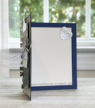
My dad celebrated a birthday this month, so I pulled a few nautical goodies from the shelves and drawers to create this neat masculine card.  All of the products that I used are from Stampin' Up!; however, most (if not all) of them have been retired.  Here's a better look at the card:


I believe this card perfectly demonstrates how the use and placement of simple products can create texture, dimension, and visual interest . . . the kind of interest that makes someone pause to take in all of the design elements before opening the card to see what's inside.  And speaking of the inside, it was decorated, too:


If you ask most card makers what's the hardest kind of card to make, they'll probably say "anything masculine".  It's the truth!  But . . . the next time you need to make a masculine card, just reach for coordinating products (not flowers, of course) and add ribbon, embellishments, punched shapes, etc. to pull it all together.


Monday, February 17, 2025

WHERE I'VE BEEN (AND A PRETTY CARD)


Remember when I said that I was going to try to breathe more life into blogging?  I was doing pretty good, and then we bought a house and moved.  Funny thing . . . my son is the one who was looking for a house and planning to eventually move, but his search found a house that he wanted my husband and I to look at.  My first reaction was that it was really pretty but too big and quite a bit above budget.  Several days later, we looked at the photos and specs and decided to do a walk-through.  Long story short, the house was perfect, we bought it, we've been slow-moving for about six weeks now, and my craft room is still in limbo.  I don't think I've stamped or created anything with paper since early December, and I can hardly wait until the rest of my craft room gets moved to the new house.  It's the big storage items (countertop, cabinets, drawers, etc.) that I'm waiting on.  Today I needed to make a sympathy card, and the February Paper Pumpkin kit was the only set of readily available products. It was quite nice to use a little of this and a little of that to create just the card that I needed.


The sentiment is from Stampin' Up!'s retired "Heal Your Heart" stamp set, which I always keep close at hand.  


As much as I enjoy how quick the Paper Pumpkin kit projects are to make and the fact that 99% of what you need can be found in that one little box, I sometimes feel that more layers and embellishments are needed for the projects.  So I added a few snippets and layers to give my card some texture and dimension.  


You know that I like to make sympathy cards as needed because, during the process, I think about the person who will receive the card and the person who has passed.  I won't mail a sympathy card unless I'm pleased with it, and I was quite pleased with this one.

Hopefully, it won't be too long before my craft room is in perfect order and ready to fully enjoy!

Have a stampin' good day!

Sunday, November 17, 2024

MASCULINE BIRTHDAY CARD - SIMPLE TO MAKE, WOW TO RECEIVE


Need a masculine birthday card but have no idea what to make?  This one is for you!

It just so happened that it was (a little past) time for me to mail a masculine card, and I saw something similar on Pinterest that I really liked.  Although the design is simple, I think it has an understated elegance and LOTS of texture!


Just look at all of the texture!  There's a rustic brick embossed background, linen texture to the black cardstock, a sleek smoothness to the gold die-cut foil, and the elevated banner (with upward-curved ends) that the "happy" rests upon.  And, of course, those two shiny gold rhinestones.  BUT . . . the texture didn't stop with the front of the card.


The inside of the card features another banner with a black heat-embossed sentiment.  Thinking of stamping the sentiment on that stark white liner seemed so "blah", and I was quite pleased with the small banner.  It will be a pleasant little surprise for the recipient, too.

So there you have it . . . a short and sweet idea for a masculine birthday card.

Have a stampin' good day!

Sunday, November 3, 2024

"MORE THAN AUTUMN"


It's been a while since I've shared a project, and it's also been a while since I've had a block of time to devote to a fun creative session with stamps, ink, and cardstock.  Today's post is a rather shameless CASE of a gorgeous project that Wendy Weixler shared recently.  When I saw her card, I was so glad that my very own "More Than Autumn" bundle was en route to me.  I loved the way that Wendy used the Perennial Postage dies to create sections on her card. 

The "More Than Autumn" bundle is most certainly a keeper!  Isn't it fun how the dies in this bundle make it easy to create a two-colored leaf???  That is just genius!  

As you can see in the photos, I added glittery accents to some of the images, which were all colored with alcohol markers.


Hopefully, you can see that the word "pumpkin" was cut from a strip of gold foil and then adhered to a snippet of ribbon.  In the above photo, you can see some of the glitter, the two-color leaves, and the sponged die-cut postage shapes.  Although my play time is limited and sometimes too scarce, this is not the last you will see of the "More Than Autumn" product bundle from me.

Shhhhhhh.  Don't tell my sister, but this is going to be her birthday card.  

I hope you have a stampin' good day!