Wednesday, June 30, 2010

CRY ME A RIBBON

My ribbon caddy says it's lonely--
it will cry the long night through.
Well, it can cry me a ribbon;
yes, cry me a ribbon
'til I can fill it with ribbon that's new.

So I just finished removing all of the retired/retiring ribbon from the caddy, and it was far more than I had imagined it would be.  The caddy is nearly empty!!!  Just look at all of the ribbon that I had to take out--some of the rolls haven't even been opened!  I'm really excited about Stampin' Up!'s new colors--I really am--but it's kind of sickening to see stacks of card stock, ribbon, designer paper, etc. which, after one more sleep, will be retired. 

PANSIES STAND FOR THOUGHTS

At my last Inkerbelles' class, we made pansies for one of our projects.  I just uncovered this one and decided to make a quick card with it.  I actually really like this card!

VINTAGE ROSEBUDS PROJECT

One of Stampin' Up!'s new products is a 2-3/8" Scallop Circle punch, which I used this morning to create the rosebuds for this Fancy Favor box.  Other Stampin' Up! products used include "Newsprint" designer paper, "Little Leaves" Sizzlits die, mini vintage tag (love these things), Heart to Heart and Small Heart punches, and a Stampin' Sponge to apply Basic Gray ink to the edges of the designer paper.

Tuesday, June 29, 2010

"GREENHOUSE GALA" SLIDER

Unless I change my mind between now and July 16th, this is going to be one of the projects at my Inkerbelles' class.  I LOVE this interactive card, and anyone who receives one of these will also love it!  I have to admit that my first one took forever, the second one took a good little while, but the third one took about 10 minutes.  As a matter of fact, I was finished so quickly that I had to double-check to make sure it wasn't inside-out, backward, or something! 
Stampin' Up! products used to create this card include BRAND NEW and GORGEOUS "Greenhouse Gala" designer paper, "Dreams du Jour" stamp set, Heart to Heart punch, Scallop Trim corner punch, and 1/4" Chocolate Chip ribbon.

Sunday, June 27, 2010

CHERRY ESPRESSO "ARTISTIC ETCHINGS"

One of Stampin' Up!'s new colors is this delicious, rich Cherry Cobbler!  It's the prettiest red ever, don't you think?  And I'm not even a lover of red!  While the "Artistic Etchings" stamp set was still out, I decided to make another card.  Stampin' Up! products used on this card include Very Vanilla, Early Espresso, and Cherry Cobbler card stock, "Because I Care" stamp set (a new Level 1 hostess set), jumbo eyelet, clear rhinestone brad, Bitty Button, linen thread, and the following punches:  Scallop Oval, Large Oval, Boho Blossoms, Heart to Heart, Small Heart, 1-3/8" Square, and Eyelet Border.  I also used some tiny rhinestones that were left from the Eggcellent Eggs Kit (Occasions mini catalog).

BOUNTIFUL HARVEST

My brother-in-law stopped by today with a bag full of goodies from his garden!  I love visitors who come bearing gifts!  He forgot the tomatoes, but we'll forgive him--this time.  My husband can have the zucchini and eggplant, but it looks like I'll be having squash casserole (maybe fried squash), steamed cabbage, something with green pepper, and cukes on the side.  Yum-O!!!!!!!

INKED & SHABBY "ARTISTIC ETCHINGS"

It's been a while since I last created something--really created something--and I'll be honest . . . my creative spirit just now seems to be trickling back to me.  Still, as much as I really like this brand new stamp set ("Artistic Etchings") and Stampin' Up!'s new "Newsprint" designer paper, I still felt a bit challenged to create with them.  Only part of my pre-ordered items from the new catalog have arrived, and I suppose that's a good thing because too many new things overwhelm me.  I can't seem to do much more than look at them.  But then . . . around 2:00 this morning, I opened my brand new Early Espresso and Marina Mist ink pads and made this card.  Other Stampin' Up! products used include the Scallop Trim border punch, natural hemp twine, metallic brads, and Crumb Cake (formerly known as Kraft), Early Espresso, and Marina Mist card stock.

Monday, June 21, 2010

WITH SYMPATHY

I needed a sympathy card tonight for one of my husband's best friends, and "Lovely as a Tree" came to the rescue.  That stamp set has been around for quite a while--for good reason.  As you can see, this is a gate-fold card, and the stamped image and sentiment were placed on opposite panels.  Stampin' Up! products used to create this card include Always Artichoke, Chocolate Chip, and Very Vanilla card stock, Chocolate Chip 1/4" grosgrain ribbon, Modern Label and Word Window punches, "Teeny Tiny Wishes" stamp set, and "Thoughts & Prayers" stamp set.

Sunday, June 20, 2010

FUN WITH THE "TWO TAGS" DIE

I had a fun class last Friday, and this cute and easy treat holder was one of the projects that I had planned for my Inkerbelles.  To make the holder, we used two tags from the Sizzix "Two Tags" die, Tempting Turquoise and Old Olive card stock, a Very Vanilla jumbo brad, Eyelet Border punch, Petals-a-Plenty embossing folder, Two-Step Bird XL punch (LOVE this punch), and one of the papers from the "Island Oasis" designer paper collection.  A clear zip-top bag holding Jelly Belly candy (which happens to be blue and green) is inside the holder, secured by the jumbo brad. 

Thursday, June 17, 2010

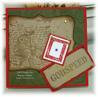
GODSPEED . . . AN OLDIE, BUT GOODIE

Several years ago, Stampin' Up! had the "Godspeed" stamp set available, I think, in a mini catalog.  At the time, my niece either was or had been deployed to the Middle East, so the stamp set was one that I really appreciated.  This set is still a favorite of mine because the images are perfect . . . helmet, Blue Star Service banner, ribbon and, especially, the soldier with the letter he's writing in the background.  A demo friend's husband has recently been deployed, and her children are struggling to understand why their daddy had to leave.  I made this card to send to them to let them know that their hero is our hero . . . one who is brave and unselfish . . . and that he is appreciated.  They are trying to see if they can receive cards from all of the states (they are stationed in Germany), so here's a card from North Carolina!

IT'S ALL GOOD

I've mentioned before that I enjoy using the "Paisley" cartridge with my Cricut Expression, and this little bee is from that cartridge.  Isn't he cute???  My mother brought me a pad of card stock on Saturday, and there were a couple of glitter sheets in the pad.  The white strip on the card and the bee's wings were cut from one of the glitter sheets, as were the bee's cheeks and the flower.  I almost always use a Stampin' Up! product or two in my creations, and this particular card features one of the brand new Itty Bitty Shapes punches (the red flower shapes along the bottom of the card).  I sent this card to my daddy to let him know that I appreciated him sharpening all of my knives on Saturday and that "it's all good" now.  I have the best parents in the world, and they still spoil me!  I think it's okay if I choose to never grow up!

Tuesday, June 15, 2010

DIAPERS AND DIPLOMAS


My husband's cousin was here last Friday (for Guy's Night Out) and, before they left with my son and my brother-in-law,  Cuz said he needed two cards . . . one for a graduation and one for a new baby.  I have a LOT of cards in this room, but I couldn't remember having a baby card on hand and was quite sure I had nothing for a graduate.   While the guys were out, I hurriedly scraped the pits of my brain for design ideas.  I kept coming up empty!  Cuz would probably not believe that, when challenged to create, ideas do NOT flood my brain.  The gate-fold baby card got its start because I've made a few gate-folds lately, and the card actually went together quite fast.  Yes, it's very simple, but I liked it.  When it was time to make the graduation card, I was really stumped because I couldn't think of a single grad-related stamp in this entire room!  And then I remembered a Sizzix embossing folder that I had purchased a few years ago.  Finding it was a totally different crisis--I hardly ever use the old Sizzix brass embossing folders--but it was found at the back of a bottom drawer.  The image embossed beautifully, and I decided that it didn't need a lot of fluff.  The best thing about the grad card is that awesome Stampin' Up! satin ribbon!  It really dressed up the card, don't you think?  And now . . . would you believe that both cards were necessary for "accomplishments" by the same guy?  Yep!  As Cuz so candidly put it, "The graduate knocked up his girlfriend!"

Friday, June 11, 2010

I CALL IT . . . "NEGATIVE GLOW"

In the previous blog post, I wrote about applying a negative effect to one of the "Summertime Splendor" digital designer papers while using Stampin' Up!'s My Digital Studio, and this is the second negative image that I created.  Isn't it striking?????  It truly looks like the flowers are glowing.  I think it's interesting how the first negative effect that I tried resembled the Soot Stamping technique, and this one looks altogether different.  The digital paper that I used on this card is the same one that I used HERE.  Card stock colors used on this card are Ballet Blue, Orchid Opulence, and Whisper White.

A NEW TWIST USING "MY DIGITAL STUDIO"

How cool is this?????  I used Stampin' Up!'s My Digital Studio program and applied a negative effect to one of the "Summertime Splendor" digital designer papers.  The pattern that I was using is the same one that was used in THIS POST, but WOW . . . what a difference!  This design actually reminds me of the Soot Stamping technique.  Every time I use My Digital Studio, I find another reason to love it!

CHALKED "ASIAN ARTISTRY"

It's just about time to bid farewell to Stampin' Up!'s "Asian Artistry" stamp set, which is a level 2 hostess set in the current catalog.  While it's not necessarily the best suited for the Chalkboard technique, I think it turned out very well.  One flap of the gate-fold was embossed using a "Finial Press" embossing folder which I had cut to make it easier to emboss narrow strips or layers of card stock.  I also used a glittery shimmer mist created with water and Champagne Mist shimmer paint, but you can't really see the sparkly glitter on the black card stock in this photo. 

Thursday, June 10, 2010

FOND FAREWELL TO MY BELOVED MELLOW MOSS

We are gathered today to fondly remember the many times when Mellow Moss was just the perfect color for many a project and how friendly and accommodating it was to many of it's Stampin' Up! brethren on the color caddy.  While no other color could possibly fill the void to replace this color, we rest assured that there will be new favorites in our future, which we will grow to love for their own unique qualities.

My customers who have been with me since the beginning will most likely remember my fondness (aka obsession) with Mellow Moss.  My favorite color combination was Mellow Moss and Eggplant Envy, which retired a couple of years ago.  I wondered how I would live without Eggplant Envy, but I survived.  This was a relatively quick card (square, which is another obsession) using "Bella's Bloom" stamp set and Blush Blossom card stock (which is also retiring).  Stampin' Up!'s Pinking Hearts Border and Corner punches and the Modern Label punch were also used on this card.

PARTY INVITATIONS

Just wanted to share the gift-shaped party invitations that I made a couple of nights ago.  They were all made from the two striped papers shown in the photo.  The party details were printed from my computer and adhered inside the card.  I love quick projects, and this was certainly a quick one!

Wednesday, June 9, 2010

SOMETHING COOL FOR A HOT DAY

I have a special great-aunt who enjoys getting cards from me, and it's a bit past time to be sending one.  I had no idea what I would make when I sat down, but then I remembered seeing this really cute ice cream image on the Cricut "Sweet Treats" cartridge.  Those cartridges have soooooooooooo many images--more than I could ever use, I'm sure--so I hope you don't mind seeing Cricut projects from time to time.  Since my blog is mainly dedicated to Stampin' Up!, most of my projects have some Stampin' Up! products used in their creation such as, with this card, the silver cord, white gel pen, Scallop Edge punch, and one of the brand new Itty Bitty Shapes punches.  I think this card is going to make Aunt Betty want a trip to Dairy Queen!

Tuesday, June 8, 2010

HONEY, I'M HOME AND I HARD A HARD DAY . . .

When I got to the mall today (yes, I went shopping again today), I saw the man in the picture come out of the mall, toss a bag or something to the ground, and then he squatted as you see him in the picture.  At first, I wasn't sure what he was doing, but I discovered (on my way to the door) that he was changing light bulbs.  I thought to myself that I might like that job, but he probably has other duties that I would not like.  So, if that was your husband and you saw this picture, would you feel sorry for him when he came home from work and complained that he'd had a hard day and was tired?  Ha!

Sunday, June 6, 2010

"SUMMERTIME SPLENDOR" PYRAMID

I'm still designing with My Digital Studio and Stampin' Up!'s "Summertime Splendor" digital designer paper.  For this card, I created five photo mats on an 8.5" x 11" project, filled the mats with the images from the digital designer paper, printed the project onto Whisper White card stock, and then cut the mats for layering on this card.  Too fun and sooooooooo easy!

Friday, June 4, 2010

CELEBRITY OR MOBSTER?

Just so you know, this blog post has nothing to do with the card . . . I just whipped it up so you'd have something pretty to look at.  This post is about an email that I got today from a Stampin' Up! demonstrator friend in Canada whom I "met" in an online demo group.  Following is a portion of what she wrote I have a funny story to tell you. The other day my friend Betty was over and we were making cards. I was talking about you and I said to Betty 'doesn't her name sound like a movie star - pronouncing your name Ree-gi-na Annn-da-ree (imagine spoken with a slight French accent). Maybe one day I'll call you so you can hear for yourself. Well, as always, my husband overheard. He comes back with 'Movie Star, sounds more like a mobster' I apologize for the moniker, you are now affectionately known as the movie star/mobster gal around here.  What I found so amusing was the fact that I've been told before that my name has a nice "ring" to it and that it sounds like a celebrity name.  One of my son's doctors used to tell us (during each visit) that every time he saw Chad's name on the chart, he was reminded of a race car driver (Mario Andretti, no doubt) and that Chad had the perfect name for someone famous.  He's definitely mastered the art of speeding!  We don't have a need or desire to be famous, but it never before occurred to me how perfectly suited our names are for being infamous.  LOL!

Thursday, June 3, 2010

"PRAY FOR YOU"

FYI . . . I recently added a song to my playlist, "Pray for You," and if you happen to listen to it, don't take it personally--or seriously.  I heard it on the radio a couple of days ago, and Jaron (who sings the song) said that it was intended to be a mean song--all in fun.  He said, "Who hasn't ever had these thoughts?"  Well . . . maybe I have a twisted sense of humor, because the song cracked me up!  If you sometimes feel a mean spirit overtake your body and would like to hear the song, scroll down to the playlist and click on the song title.  And just so you know--I do NOT pray that a flower pot falls from a window sill and hits you on the head.

Wednesday, June 2, 2010

SYMPATHY CARD . . . DIGITAL STYLE

Yes, I'm still playing with designs created with "My Digital Studio" and the "Summertime Splendor" digital designer paper.  With this design, I was going for a look of "Spotlight Technique on Vellum".  The oval portion is the "spotlight" . . . darker in color and (digitally) matted with Night of Navy . . . and the spotlight is (digitally) adhered to a background which mimics a floral image stamped and colored on Vellum card stock.  Is that what this card looks like to you????  This effect was achieved by using the Opacity tool in My Digital Studio.  The sentiment is enlarged and from the "Thoughts and Prayers" stamp set, which is just one of many sets of images that come with the MDS program.  Even though I already own "Thoughts and Prayers" and could have stamped the sentiment on the printed design, I would not have been able to manipulate the size of the sentiment without the MDS program.  Other Stampin' Up! products used to create this card include Night of Navy, Whisper White, and Bashful Blue card stock, Scallop Trim Corner punch, and Certainly Celery grosgrain ribbon.

SNAIL MAIL

I had a great visit with my grandmother on Sunday, so I started making this card for her last night.  The first one I made was just blah . . . too plain . . . and so was the second one.  So I decided to put the snail on a  gate fold, which turned out to be a good idea because it adds something fun and interesting to an otherwise "just cute" card.  When you're working on a card, and it just doesn't seem to look good enough, try a fun fold instead of starting a new focal point!  ;-)  The snail and sentiment were cut with my Cricut Expression and the "Paisley" cartridge.

ANOTHER DIGITAL DESIGN

A couple of days ago, I sat down with Stampin' Up!'s "My Digital Studio" program and experimented with new designs using the "Summertime Splendor" designer paper download.  Let me tell you . . . designing with MDS is addictive and good, clean fun . . . literally because you don't have to get out any supplies.  You don't even have to own all of the ones you use with the program!  I cannot tell you exactly how quick and easy this card was to make!  I had already printed the artwork that I'd designed, and all I had to do tonight was adhere it to the card and add the ribbon!  This card is ready to go!  If you are a customer of mine and would like for me to demo MDS for you, let me know!