Sunday, August 11, 2019

HOW TO STAMP AN EASY AND PRETTY FALL WREATH

The other night, I looked at Stampin' Up!'s Colorful Seasons and Painted Harvest stamp sets and tried to create a Fall wreath with a couple of the images.  I tried a variety of ink colors, and I didn't think I really loved any of my creations--even the one that became the card that I'm sharing today.


I picked up the white cardstock tonight that had my "wreath" stamped on it, and I started to throw it in the trash.  I'm glad I stopped myself, though, because all it needed was a little enhancing.  Do you love this wreath as much as I do?  Let me explain how I made it.  I started by drawing a circle that would serve as a guide for stamping.  I then stamped the leafy stem detail image from Painted Harvest stamp set using Soft Suede ink (a pad that really needs to be re-inked).  Next, I used Pool Party ink to stamp the solid leaf and Early Espresso ink to stamp the twig--both images from Colorful Seasons.


Seeing the stamped images, can you understand why I almost considered it trash?  To jazz it up, I punched three shapes with the Sprig punch from Copper Foil and three shapes with the Leaf punch from Vellum Cardstock.  I gently bent the sides of the punched leaf stems and then adhered all of the punched shapes on top of the stamped wreath.  It still didn't look fabulous, but it was looking pretty promising.  An Early Espresso 2-1/4" punched circle placed in the center of the wreath made a big difference!  I really wanted to use that sentiment (from Country Home stamp set), and I gave myself permission to place rectangle layers on top of the punched circle.  I ❤ it!!!  It's hard to tell, but the sentiment was stamped with VersaMark ink (I remembered to use the Embossing Buddy first) and heat-embossed (with Copper Stampin' Emboss Powder to coordinate with the Copper Foil punched sprigs. You can see that my finishing touches were the Corrugated Elements tag (retired), small punched heart (retired punch), Rhinestone Jewel, and Linen Thread.  Because the Whisper White layer still looked a bit plain at the top and bottom, I chose to place a cut of Polka Dot Tulle Ribbon (love, love, love this ribbon) along the bottom.  Cardstock colors used on this card are Whisper White, Early Espresso, and Pool Party.


Sooooooooo . . . what did we learn?  We learned that if something doesn't seem worthy for a card, it might just need a little embellishing.  Some might say that the finished card doesn't even look like a wreath, but I know that's what it is and I LOVE that three stamps and three punches brought it to life.

I have provided links in this post to the products used to create this card, and I'd love to send you a handmade thank you card for shopping with me!  Or just leave a comment and tell me what you think about it.


Wednesday, August 7, 2019

IT'S A HEAP OF HEARTS!

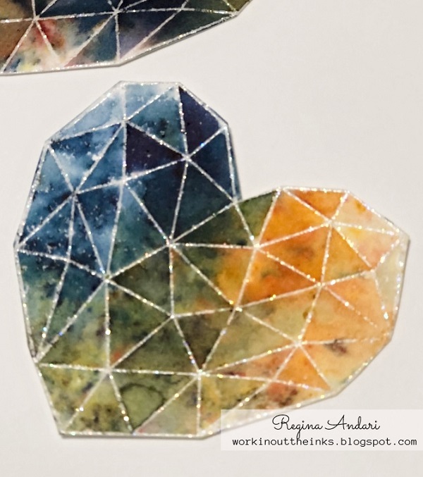
When I first laid eyes on the Modern Heart stamp set in the Stampin' Up! catalog, I knew that it would eventually be mine.  The set has a wonderful selection of sentiments, but . . . wow! . . . just look at that heart!


Yesterday I was wanting to make something, but I wasn't really feeling very creative.  After surveying the stamp sets before me, it was Modern Heart that got my attention.  That heart image was ready for a color showdown!  I kept this heap of 15 hearts, but I worked with at least 20-25 of them.


All of the hearts that I kept had been stamped onto watercolor paper.  Regardless of the color medium (Watercolor Pencils, Aqua Painter + Ink, or Brusho crystals), my entire experience was most pleasant with watercolor paper.  I should interject that while the Watercolor Pencils were easy to work with and blend, they were not my favorite color medium for the hearts because I couldn't keep a brilliant, vivid color in the small facets.  Regarding the paper to use . . . if you were going to use only markers or Stampin' Blends, the Thick Whisper White cardstock or perhaps a smooth watercolor paper would be a better choice.  

Up first were ink pads and an Aqua Painter to color the images.  I stamped the image a few times with VersaMark onto the watercolor paper, and then heat-embossed with Black Stampin' Emboss Powder.  I experimented with coloring from left to right, but my favorite method was actually coloring from the center out.  In doing so, I started by laying down the Daffodil Delight or Pineapple Punch color, and then moved from color to color.  By starting the color process in the center, it was much easier to achieve some blended color along the way to the outer edges.  The ink colors that I used the most were Daffodil Delight, Pineapple Punch, Mango Melody, Pumpkin Pie, Real Red, Lovely Lipstick (my favorite red for this project), Gorgeous Grape, Night of Navy, Pacific Point (my favorite blue for this project), and Granny Apple Green.  When coloring the images with an Aqua Painter, it's easy to go back and move the colors around and/or add more of a color that might be lacking.  Obviously, the brightest colored hearts were my favorite!


Since the black embossed images turned out well, I then decided to try embossing with Iridescent Ice embossing powder (a retired Stampin' Up! product) and coloring with Brusho crystals (retired but similar to the current Pigment Sprinkles).  I love the glitter in the Iridescent Ice powder and felt that it would add the right amount of sparkle to my hearts with multiple facets.  And it did.  


Just look at the sparkle!


I was really enjoying the Brusho crystals, so I stamped some more images and embossed them with Black Stampin' Emboss Powder.  The one Brusho color that I wasn't too pleased with was the Moss Green because it kept giving a muddy appearance to my otherwise brightly-colored hearts.  In the end, I appreciated the "less is more" application of color.  On most of the hearts shown below, I sprinkled the Brusho crystals onto the stamped and embossed heart, and then spritzed with water.  For the most part, I left the paper to dry on its own but tilted it to help the water run as needed.  These were my favorite hearts!


I love how vivid the colors turned out!

  
These stamped hearts were so easy to color and easy to cut out!  Now that I have a heap of them, I'm ready to start adding them to some cards and will eventually share photos.  If you're still reading this post, thank you for staying with me.  Aren't you ready now to color a bunch of these hearts for your cards???

Sunday, August 4, 2019

PATRIOTIC PILLOW

After completing my patriotic geranium wool applique block, I couldn't get the idea out of my head of using it on a pillow cover.  It would just be too perfect!

So I gathered together a pillow cover and some Chalk Couture transfers for my project, and here it is:


There's even a design on the back of the pillow!
Below is a photo of the pillow cover before the pillow form was inserted:


After transferring the Chalk Couture designs onto the pillow cover and setting the ink with my Cricut Easy Press, I was ready to stitch the wool block onto the cover.  Although this project took a bit longer from start to finish than a lot of projects, each step was easy to accomplish.

Chalk Couture products featured on this project include (photos at bottom of post):
Stars and Stripes Chalk Transfer
Pinwheels Chalk Transfer
Beach Day Chalk Transfer
Cut Apart Hearts Chalk Transfer
Retro Ornaments Chalk Transfer
Candy Apple Red Couture Ink
Shimmer Gold Couture Ink
Midnight Sky Couture Ink

Are you ready to start making some beautiful Chalk Couture projects for your home?  Check out the fantastic products HERE.  Have questions?  Email me at randari at hotmail dot com.

ETA:  Some of the Chalk Transfers that I used for my pillow are either retired or currently unavailable.  Since I've had a few questions about what those transfers looked like, I am posting photos below.  From the photos, you can tell how wonderful it is to mix and match images from assorted Chalk Transfers.  The images featured on my pillow are circled in red:


Couture Ink colors used:  Candy Apple Red, Shimmer Gold (paste is shown in 
the photo, but I used Shimmer Gold Couture Ink), and Midnight Sky


Tuesday, July 30, 2019

PATRIOTIC GERANIUM BASKET

Sunday was a sewing day for my mother, sister, and I.  That usually means that I will work on a wool applique project, but it's been so long since we had a sewing day that I couldn't remember what I worked on last.  My task on Saturday evening was to search my applique patterns (I've been "collecting" them for several  years) and choose one for my Sunday project, and I chose the geranium basket designed for the 2017 Summer Mystery Blog Hop by Primitive Gatherings.  By clicking the link, you can read all about it.  My basket doesn't look quite as neat as the designer's, but I'm pleased with it.  HUGE shout-out to my sister for cutting all of those tiny red petals for my geraniums!  I thought about using a die to cut them, but the pattern called for 92.  What???  At the very least, that would have required 46 passes through the die-cut machine since my tiny flower die was a thin one!


The original pattern had embroidery stitches for the red stripes, but I really liked the look of red wool and felt that it made the flag a more prominent feature on this project.  Besides, the last stripe on the U.S. flag is red, and that's what I wanted for mine.  I liked the look of the stitched stars on the blue field (as depicted on the pattern), but I knew that I'd make a hot mess trying to stitch star shapes and used die-cut stars instead.  One of the best things about being a paper crafter and owning a lot of dies is that they can also be used to cut fabric, wool, felt, etc.  Dies were also used to cut the USA letters, which turned out to be too large for my basket and required a different plan.  After finding a new place for the letters, I ended up not wanting to put a geranium under the "U".  I had already stitched a stem there, and covering it with a leaf wasn't quite enough, nor was the chain-stitched skinny stem.  Cue the yellow heart embellished with a Hotfix Swarovski crystal!


I haven't yet decided where this patriotic block will end up.  I am considering stitching it to a pillow cover or I could just finish the edges and display it in my home.  I have even thought about stitching some more patriotic designs to be used in a quilt.  There are many options, of course, but the pillow cover idea is really calling to me.  I'll be sure to post a photo if I decide to do that.


Sunday, July 21, 2019

JULY CLASS SWAPS - TUCK N FOLD BOXES

At my June class, one of the projects was this Tuck n Fold box (or maybe it should be called a Fold n Tuck box):


This box was so well-received that we decided to make more of them for our July class swap.  Just look at the beautiful boxes my stampin' friends made:


And these are the boxes that I made for the swap:


This box, which I believe was the brain child of Sam Donald, is such an easy and fun one to make.  Best of all, it can be stored flat until ready to use, and requires no adhesive.  Does it get any simpler than that?


Friday, July 19, 2019

"BEAUTIFUL FRIENDSHIP" NOTE CARDS

I think I have already mentioned that I ❤ the Beautiful Friendship stamp set.  Just look at the gorgeous images and perfect sentiments:


This is one of those sets that you will reach for again and again.  With a lot of stamp sets, you need to have an idea in mind before you begin stamping.  With Beautiful Friendship, you can just start stamping and see where your art takes you.  You would have to try pretty darn hard to make an unsalvageable mess with these stamps!

I was playing creating a few nights ago while watching a movie, and I didn't have any specific design ideas.  A birthday card was needed, and I chose a few ink colors (Grapefruit Grove, Balmy Blue, Mossy Meadow, and Gorgeous Grape) and just started stamping.  


I was so pleased with how well the colors and images worked for the birthday card that I cut a few more pieces of cardstock and whipped up these "a little note" cards:


Of course, I couldn't stop there.  It didn't seem right to send these beauties in naked envelopes, so they got stamped, too.


Other Stampin' Up! products featured on these cards include:
Stamp Set:  Butterfly Gala, Varied Vases
Cardstock:  Whisper White, Balmy Blue
DSP/Specialty:  Gingham Gala (retired), Perennial Essence Vellum
Accessories:  Whisper White Baker's Twine

Monday, July 15, 2019

"FLOURISHING PHRASES" POP-UP FLOWER BOX

Don't you love it when you need a card idea fast, and Pinterest provides the perfect one--and you didn't have to spend hours searching the boards?  The usual visit to Pinterest might require a snack and drink before you begin, but that wasn't the case for me last night.  I needed a cheery card to send to a cousin who hasn't been feeling well for a couple of weeks.  I knew that I wanted to use the cute turtle from Stampin' Up!'s Back on Your Feet stamp set, and this is what the front of my card looked like:


Too playful with that flower spray?  I'll admit that the two images don't seem to pair all that well, but I wasn't so turned off to the idea that I omitted the sickly turtle.  Hopefully, this card will make my cousin smile, and I'm sure the inside will lift her eyebrows--and maybe her spirits!  


Is this not the cutest pop-up flower box?  The creative genius was France Martin, and I loved her idea to stamp the flower spray on the inside of the card before adhering the pop-up box.  She may have stamped hers using green ink, but I used black and then colored the flowers and leaves with Coastal Cabana, Old Olive, Crushed Curry, and Melon Mambo Stampin' Write Markers.  The Flourish dies were used to cut assorted shapes from Lovely Lipstick, Bermuda Bay, Crushed Curry, and Pear Pizzazz cardstock to fill the pop-up box, which was a piece of Soft Suede cardstock.  I used Soft Suede ink to stamp the Birch background image on the box, which I thought added a lot, and then adhered the decorative die-cut strip from Whisper White cardstock.


This is not the last pop-up flower box that I will make, and I'm pleased to have yet another fun use for the Flourishing Phrases stamp set and Flourish dies!  

Want me to make one of these cards for you?  When you order the stamp set and dies AND use my current hostess code (located in top left sidebar), I will make one of these cards to send to you!

Flourishing Phrases Stamp Set
Flourish Dies


Friday, July 12, 2019

POP-UP CRIB FOR BABY

My mother recently requested a card to send to one of her friends who became a grandmother.  I don't personally know the magnitude of how special that is, but I do know that it's a hugely happy time.  And when you're a card-maker and your mother requests a card, you do it up in style.  Since the card was for a special friend, I wanted to make something extra special.  And so . . . this pop-up crib card was born.


I had so much fun making this card and adding special little details!  As a card-maker, I like to assume that most people won't throw my cards away--or at least not right away.  Stop it!  I can hear some of you laughing at me for being so naïve.  The front of the card included some keepsake-worthy details, such as the baby's full name, circled date of birth, and (albeit tiny) time of birth.


The WOW happens when the card is opened . . . 


The little crib pops up, and it is "filled" with a diaper pin and two ducks in coordinating colors.  At the back of the crib, there's a coordinating patterned vellum pocket (see the "Congratulations" layer?) where a note can be written.  This is also where the card was to be signed.  By the way, figuring out where to provide space for a written message took the most ridiculous amount of time.  Ha!


How cute is this chest of drawers, complete with a onesie, blanket hanging out of the bottom drawer, and an empty hanger?  You may have noticed that a die-cut toy got squished between the "wall" and the crib . . . [laughing at myself] . . . I should have known better than to glue the toy at the corner where the crib would be anchored! Sometimes when you're building and creating as you go, you just don't predict what could be coming next.  I tried to remove the toy, but it was stuck really well.  At the other end of the crib, I used the pretty space to include a punched glittery heart and more birth details.

I know I probably come across as really proud of this card, and I am!  Of course, it took longer to make than most cards, but that makes it more special to give.  What do you think?  Do you love it?

Tuesday, July 9, 2019

WIPER CARD FOR MY NIECE'S BIRTHDAY

My sweet niece had a birthday on July 4th but, instead of sending one of my patriotic cards, I made this Wiper card for her special day:


I can't remember the name of the paper pack, but aren't the soft purple and green shades pretty?  The paper also had a perfect amount of gold throughout.  Although the sequins appear to be the wrong color, they were actually the perfect purple--just not easy to photograph.

Saturday, July 6, 2019

"HERE COMES THE SUN" . . . JULY CLUB COUTURE PROJECT

Want to see one of the best pieces of mail that I received this week?


It's the July Club Couture transfer ("Here Comes the Sun").  I always look forward to seeing what the club transfer will be, and I was anxious to start working with this one.  Chalk Couture Designers receive the club transfer free as part of the web site fee that we pay monthly, but we don't receive the Chalk Paste Singles--just the transfer.  I ❤ this one!  When I saw that big sun and waves image, I immediately thought that the sun would be perfect for the ombre technique.  What is the ombre technique?  I'm glad you asked!  Very simply, you place one color on the top portion of an image and a second color at the bottom portion, and then use your finger to blend the two colors together before the paste dries.  The Chalk Paste colors that I used for my sun are Lemon and Couture Coral.

Another fun and easy technique that I used on this project was to add glitter to the word "SUN".  It is so sparkly in person, and I was glad that I thought to add glitter before the paste dried.  The process is simple . . . sprinkle the glitter onto wet Chalk Paste and then, once the paste has dried, just use a brush (or Dust-Off) to remove the excess.


It probably wasn't even necessary to share the above close-up photo since the glittery sparkle is hard to capture.  Ha!  

Chalk Couture products featured on my project include:
July Club Couture Chalk Transfer ("Here Comes the Sun")
Chalkology Paste (Lemon, White, Caribbean, Couture Coral)

Have you heard of Chalk Couture's Club Couture?  It's a monthly subscription kit that includes a Chalk Transfer (exclusive to Club Couture) and three Chalk Paste Singles.  The kit, which includes step-by-step project instructions, ships for FREE!!!  Following is the promotional project created by Chalk Couture featuring the July transfer and paste colors on the 5.5" x 7.5" Box Frame.


Have questions about Chalk Couture products?  Let me know!