Sunday, April 24, 2022

SWEET SONGBIRDS


One of my favorite bundles from Stampin' Up!'s new catalog is "Sweet Songbirds".  When my preorder arrived, the stamp set and coordinating punch were the first products that I worked with, and I'm sharing today the card that I made.

The photos aren't the best (apologies for that), but isn't this just a sweet little card?  It's perfect for when no words are needed or maybe words are hard to find.  This pretty songbird will be just right!  Of course, there had to be a coordinating envelope:


"Sweet Songbirds" is a stamp set that you will not grow tired of using, and I recommend adding it to your wish list.  The products in Stampin' Up!'s new catalog will be available soon . . . days, really . . . and then you can be all set to send sweet mail like this!


Monday, April 18, 2022

COLORING AN EMBOSSED BACKGROUND WITH A WATER BRUSH


When Stampin' Up! retired the Country Floral embossing folder, I knew I would have to keep mine because it's just so pretty--and I knew I would continue to use it.  I've never used it the way I did for this card, though, and now I love it even more!  While this project may make you want Country Floral, keep in mind that this technique can be used with other embossing folders that you have.  The technique is quite simple but, before I tell you about it, take a look at the card . . . 


It's so pretty, right?  If you're thinking it's a tedious, time-consuming technique, you're in for a surprise.  After I embossed the cardstock, I used a water brush and ink to color the embossed (raised) areas.  The fun thing about using the water brush is that I was able to achieve dark and light coloring, as well as blend colors for more realistic roses.  I believe I used Calypso Coral, Flirty Flamingo, and Daffodil Delight on them. 


For the purple flowers, I first colored with Highland Heather and then "dotted" random areas with Gorgeous Grape ink.  Other ink colors featured on this card are:  Pear Pizzazz, Old Olive, and Pool Party.  


The above photo does a good job of showing just how beautifully and deep the embossing is on this card.

I used the Bough punch for the leafy stem.  After the above photo was taken, I decided to "fluff" the leaves by gently bending the sides of them with my fingers.  The die-cut bird is from the "Birds & Branches" stamp set and "Birds & More" dies.  Finishing touches to this card were the addition of scattered sequins, a twine bow, and a brush of Wink of Stella on the roses.


Dig through your embossing folders and choose one that embosses deeply so you can try this technique.  I know you want to.  😉


Sunday, April 10, 2022

APARROTLY, IT'S DADDY'S BIRTHDAY


When I pictured this card in my mind, it looked bright and cheery . . . and not at all juvenile.  As a matter of fact, I had all of the parrots colored and die-cut a week or so in advance, just waiting to use circle dies to cut the assorted sizes and colors to create the rainbow for this card.  When I was nearly finished with assembly, that's when I realized that the card looked more fitting for a birthday boy and not so much for my 84-year-old father.  But can you guess what I did?  I mailed it anyway because who among us would frown upon opening a bright and cheery birthday card???  I didn't take a picture of this card folded flat, but that's the beauty of this platform pop-up card . . . it folds nearly flat for mailing and then pops up to the shape of a fun and dimensional structure, which is quite sturdy.  Following are more photos:


After cutting the colorful circles (frames, actually) for the rainbow, I cut them in half to avoid bulk when the two platform pieces were adhered together.  An extra circle, the same size as the largest (red) rainbow frame, was cut from a piece of Window Sheet.  After adhering the red, orange, yellow, blue, and purple half-circle pieces to the top half of the Window Sheet, the lower half was adhered between the two platform bases.  This made the rainbow very sturdy!  


You can see from the top view of the card (above photo) that the rainbow was visible from both sides, so I adhered clouds on both sides as well.


Since the back of the card was looking pretty good, I figured it needed a couple of party parrots.


And, of course, the envelope needed to be decorated with a parade of colorful party parrots.  

Daddy enjoyed his card, and he even knew exactly how to make it pop up for display!  I guess he's learned a thing of two from the many different kinds of cards I've mailed through the years.  Ha!


Monday, April 4, 2022

THANK YOU CARD FEATURING MARCH 2022 PAPER PUMPKIN


This month's Paper Pumpkin kit from Stampin' Up! included an extra (FREE) stamp set that is featured on the card that I'm sharing today.  The inspiration for my card came 100% from the flyer that was in my kit.  I loved everything about the flyer sample which is shown below:


It's so crisp, right?


I was so pleased with the finished card, which features Rhinestone Waves Basic Jewels and Brushed Brass Butterflies.  Of course, that lovely die-cut tag is from Tailor Made Tags dies, which I think every paper crafter should own.  My ink colors are So Saffron, Crushed Curry, and Misty Moonlight.  The Bough punch was used to cut the greenery (Pear Pizzazz and Mossy Meadow).

This is definitely a card design that I will use again and again because it was quick to make and (IMHO) has a lot of dimension and visual appeal.

Friday, April 1, 2022

SIMPLE & CHEERY SAILBOAT CARD


Today I hope to play with some new stamps and dies but--first--I wanted to share this cheery sailboat card.  It features Stampin' Up!'s "Let's Set Sail" stamp set + Sailboat Builder punch.  Those pretty jewels???  They're "Rhinestone Waves Basic Jewels" from the Waves of the Ocean bundle, and they are sooooooooo pretty!


The cardstock colors that I used for this card are Daffodil Delight and Melon Mambo, and the sentiment strip is Pool Party.  When it came time to decide the best way to use the punch, what seemed easiest for me was to punch the cardstock and then stamp the images.  Of course, there had to be a coordinating envelope:


I think it would make my day just pulling this envelope out of the mailbox!


Monday, March 28, 2022

STRAWBERRY POP-UP CARD


I tried to resist the urge to purchase the set of dies that so easily makes this card. I tried really hard.  I even slept on the urge, thinking that surely I could talk myself out of it by morning.  I told it to get out of my head . . . to just skidaddle!

Sooooooo . . . the card that I'm sharing today, which features Stampin' Up!'s "Strawberry Builder" punch and "Sweet Strawberry" stamp set (both of which are in the process of retiring), also features my brand new Platform Pop-Up die from Lawn Fawn that I couldn't resist.


This was such a fun card to make, and it's impressive how easily it comes together and how it folds flat for mailing . . . and how smartly it pops right up to show off whatever pretty details you add to it.  See below how it folds flat for mailing:


The photo below shows how spacious the card is when it's on display:


And below is another sideview:

So far, I don't regret my purchase; however, the one downside (which is kinda big) is that most people that I send cards to will certainly not know (and possibly won't figure out) how the card works.  That kinda means that this might not have been a wise investment.  I took this card to my parents' house last Thursday and asked my mother if she thought aunt Betty would figure out what to do with it, and she agreed with me that the answer was NO!  I knew it--in my gut, I just knew it.  The only thing left to do was sign the back of the card and ask my mother to deliver it to Betty and show her how it works.  She was so sweet to deliver this card to Betty, but she didn't agree to hand-deliver more of these cards.  LOL  That means I probably won't get as much use from my new dies as I would like, but maybe I'll remember to think about this the next time I think there's a new die that I must have.  


My purchase doesn't have to be a real loss.  I may not be able to send cards like this very freely, but I can probably create seasonal/holiday displays that I can enjoy around my house.

Monday, March 21, 2022

Z FOLD FEATURING "NEW HORIZONS" DESIGNER PAPER


Today I have a pretty card to share that features Stampin' Up!'s "New Horizons" designer paper, and the design that I used on this card happens to be my most favorite in the collection.  It really needed very little embellishment, but aren't the little pebbles adorable?

This particular card is a z-fold that was totally inspired by pattystamps.com.  She has an easy-to-follow video, so check it out. I love how she has used assorted designer paper on her z-fold cards, and I couldn't resist the urge to make a couple of cards myself.  I just made a couple of minor changes to my card . . . (1) Patty had the sentiment panel placed at the far right, which means that it is in view whether the card is open or closed.  I didn't want the sentiment in view, and I love how my little change allows the initial scenery of the card to continue uninterrupted by a boring signature panel.  (2) My other change to Patty's design was to place the greeting (layered circles) on Stampin' Dimensionals, which hold the card closed and give the recipient the pleasure of "untucking" that z-fold to see what's inside.  

See the z-fold below:


In the photo below, you can (hopefully) see how placing the Stampin' Dimensionals on the right side of the punched circles leaves ample space to tuck the z-panel:


Didn't the designer paper do a fantastic job of beautifying this card?  I think the die-cut fence panels really add some visual dimension . . . the pebbles, of course, are dimesional.  The die-cut grass (from the "Horizons" dies) adds dimension, even though it's hardly noticeable.


My card features the following Stampin' Up! products:
Cardstock:  Mossy Meadow, White
Designer Paper:  New Horizons, In Good Taste 
Stamp Sets:  Tulip Fields (stamped clouds), Whimsical Words (retired)
Sizzix:  Horizon dies (fence panels)
Punches:  1-3/4" Circle, 2" Circle (both retired)
Accessories:  Brushed Brass Butterflies (these are adhesive-backed & gorgeous), Pebbles Enamel Shapes (also adhesive-backed), Stampin' Dimensionals


Do you need this designer paper?  YES, you do!

Thursday, March 17, 2022

"FOREVER FERN" SYMPATHY CARD


 A sympathy card was needed this week, so I reached for "Forever Fern" stamp set and created this simple design.


This card features the following Stampin' Up! products:
Cardstock:  White, Pacific Point, Vellum
Ink:  Pacific Point, Pear Pizzazz, VersaMark
Stamp Sets:  Forever Fern, Heal Your Heart (retired)
Sizzix:  Tasteful Texture embossing folder
Accessories:  Rhinestone Waves Basic Jewels, Silver embossing powder, Heat Tool, Flax Ribbon (retired)

Did you notice the GORGEOUS jewels on this card?  They are part of the "Waves of the Ocean Suite Collection" that is available NOW.  I originally purchased the jewels, but I now have the entire suite on order and can hardly wait for it to arrive!  Just look at all you get in the collection:


Special Thank You Offer:  When you purchase this collection from me, I will make a thank you card (once the bundle that I ordered arrives) with these products and send it to you!  😊


Sunday, March 13, 2022

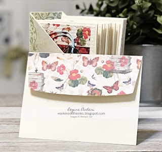
NOTE CARD SET + MAGAZINE STYLE HOLDER


Remember in my previous post when I mentioned that I'd be sharing a note card set?  Well, today is the day, and the first photo is what the completed set looked like.  Not to brag, but this set turned out beautifully!  It's been a while since I made a mini magazine holder, so I was pleasantly surprised when the first try was perfect.  Following are some photos of the holder:


The designer paper that I used is the Mariposa stack from DCWV.  I've had this paper collection for quite some time and have used assorted cuts for a few projects, but this project is my favorite!


To cover the holder, I cut the paper as needed--hoping that each slice would be a perfect fit.  Not only did I get lucky with that, look at how beautifully the papers matched up at the corner in the above photo.  Yep, that was random luck.


I have to point out how perfectly the papers lined up in the above photo making a nearly complete butterfly at the corner.  Could I have gotten more lucky?  I don't think so!  I was just grabbing papers to decorate the holder, and I didn't even notice until I was finished that the papers lined up so well.  Would you like to see the note cards that I made?


Making these cards was quite relaxing because I started by cutting all of the strips so that all I had to do was adhere them to cardstock, which was then embossed.  


The gold foliage accents worked nicely, don't you think?  They're retired Forever Gold Laser Cuts from Stampin' Up!  I had such high hopes and plans for using them at the time they were purchased, but then I forgot I had them.  Do you do that, too?


Of course, the envelope flaps begged to coordinate, so I spent a little extra time to do that.  


The complete set was tied up with a coordinating piece of seam binding ribbon.

Because there was extra space in the holder when all was said and done, I cut up some of the Mariposa papers (since they are white on the back) to be used for notes, grocery lists, etc.  You might want to remember this because not only is it a great (and coordinating) filler, it's a very useful thing to include with card sets.  As a matter of fact--for a few years now--I have been using cut up patterned paper as scrap/note paper.  When I doing some purging in my stamp room a few years ago, there was a LOT of paper that I decided I would never use.  Some of it was set aside to give to my sister, but garbage bags were getting filled with the rest.  At some point, I had the "ah ha!" moment to cut the paper to 4x6 to use for scrap/notes.  This has been one of the most genius things I've ever done!  I hate throwing away things that weren't a cheap spend, but finding an alternate way to use them feels less wasteful.  Pictured below is one of the note paper bundles that I made from single-sided designer/pattern paper that has a solid white/ivory back:


Tuesday, March 8, 2022

"COUNTING SHEEP" BABY CARDS (and a lesson in sheep)


One of my mother's quilting friends, Jean, recently requested some baby cards featuring a lamb, but all that I could think to use was the "Counting Sheep" stamp set.  I know that I should probably have known already (and maybe I did many, many years ago), but I had to do a little research to confirm that a lamb was, indeed, a sheep.  In case you're like me, I'll save you the research . . . mature sheep are sheep (the male is referred to as a ram, the female is referred to as an ewe), and an immature sheep (under one year old) is a lamb. 

After getting educated on sheep, I decided that I would make a few cards (prototypes) so my mother's friend could have choices.  First up is this sweet "in the clouds" design:


The punched clouds are actually from the retired Tree Builder punch, and I have used that punch to make way more clouds than I ever used it for trees.  I also used one of the punched shapes and a Blender Brush to create the cloud-filled background.  I ended up making more of these cards, and HERE'S A TIP . . . it was easier and quicker to create the background when I adhered four punched clouds together (side by side) so that they stretched across the front of the cardstock.  Other Stampin' Up! products featured on this card include:
Cardstock:  White, Balmy Blue, Silver Foil
Stamps:  Counting Sheep, Hello Life (retired)
Ink:  Balmy Blue, Black, Smoky Slate
Sizzix:  Sheep dies
Punches:  Small Star (retired), Tree Builder (retired)
Accessories:  Stampin' Dimensionals, Blender Brush, Blender Pen (to add color and blush to the sheep), Wink of Stella, non-Stampin' Up! twine and sequins

I couldn't remember if it was known whether the baby is a boy or girl, so I thought I should include a unisex color for the second card:


Isn't it sweet . . . the fluffy lamb trying to catch the balloon?  This sweet design features the following products:
Cardstock:  White, Crumb Cake, Soft Sea Foam, Daffodil Delight
Stamps:  Counting Sheep, Knit Together
Ink:  Soft Suede, Smoky Slate, Black
Sizzix:  Sheep dies, Falling Petals embossing folder (retired)
Accessories:  White Accents, Stampin' Dimensionals, Blender Pen, Wink of Stella

The third design featured a pink and white color palette:


Although the overall design is so, so simple, I think it's so sweet with the floating hearts.  Stampin' Up! products featured on this card include:
Cardstock:  White
Stamps:  Counting Sheep, Hello Life (retired)
Ink:  Blushing Bride, Smoky Slate
Sizzix:  Sheep dies, Scalloped Contours dies
Accessories:  Rhinestone Basic Jewels, Stampin' Dimensionals, Blender Pen, Blushing Bride Frayed Grosgrain Ribbon (you can't tell from the photo, but the ribbon was a perfect match for the gingham paper)

So my mother showed these three cards to Jean, and she had a hard time deciding on just one card.  In the process of trying to decide, it was mentioned that I have a quilt that needs to be quilted (because I just don't want to do the quilting!!!).  Jean is a longarm quilter, so a deal was made . . . I would make several of these cards (all three designs), and she will do the quilting.  That was so very exciting for me!  But . . . I couldn't just let Jean do the quilting for a handful of cards, so I made a really neat set of note cards for her as well as all of the baby cards.  In my next post, I'll share photos of that set which features a mini magazine holder that turned out so pretty!