
When I first laid eyes on the Modern Heart stamp set in the Stampin' Up! catalog, I knew that it would eventually be mine. The set has a wonderful selection of sentiments, but . . . wow! . . . just look at that heart!

Yesterday I was wanting to make something, but I wasn't really feeling very creative. After surveying the stamp sets before me, it was Modern Heart that got my attention. That heart image was ready for a color showdown! I kept this heap of 15 hearts, but I worked with at least 20-25 of them.

All of the hearts that I kept had been stamped onto watercolor paper. Regardless of the color medium (Watercolor Pencils, Aqua Painter + Ink, or Brusho crystals), my entire experience was most pleasant with watercolor paper. I should interject that while the Watercolor Pencils were easy to work with and blend, they were not my favorite color medium for the hearts because I couldn't keep a brilliant, vivid color in the small facets. Regarding the paper to use . . . if you were going to use only markers or Stampin' Blends, the Thick Whisper White cardstock or perhaps a smooth watercolor paper would be a better choice.
Up first were ink pads and an Aqua Painter to color the images. I stamped the image a few times with VersaMark onto the watercolor paper, and then heat-embossed with Black Stampin' Emboss Powder. I experimented with coloring from left to right, but my favorite method was actually coloring from the center out. In doing so, I started by laying down the Daffodil Delight or Pineapple Punch color, and then moved from color to color. By starting the color process in the center, it was much easier to achieve some blended color along the way to the outer edges. The ink colors that I used the most were Daffodil Delight, Pineapple Punch, Mango Melody, Pumpkin Pie, Real Red, Lovely Lipstick (my favorite red for this project), Gorgeous Grape, Night of Navy, Pacific Point (my favorite blue for this project), and Granny Apple Green. When coloring the images with an Aqua Painter, it's easy to go back and move the colors around and/or add more of a color that might be lacking. Obviously, the brightest colored hearts were my favorite!

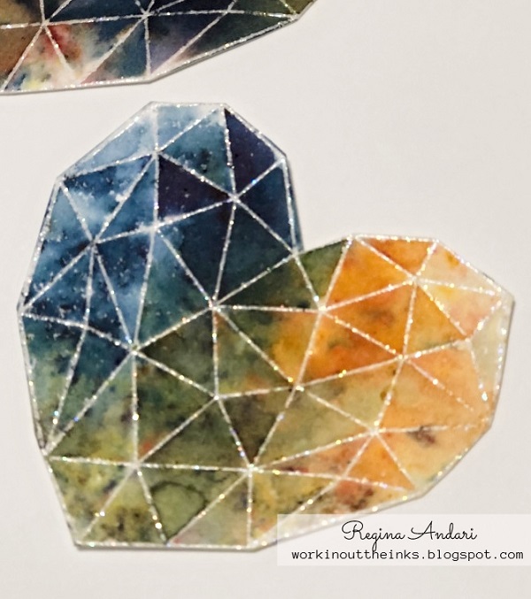
Since the black embossed images turned out well, I then decided to try embossing with Iridescent Ice embossing powder (a retired Stampin' Up! product) and coloring with Brusho crystals (retired but similar to the current Pigment Sprinkles). I love the glitter in the Iridescent Ice powder and felt that it would add the right amount of sparkle to my hearts with multiple facets. And it did.

Just look at the sparkle!
I was really enjoying the Brusho crystals, so I stamped some more images and embossed them with Black Stampin' Emboss Powder. The one Brusho color that I wasn't too pleased with was the Moss Green because it kept giving a muddy appearance to my otherwise brightly-colored hearts. In the end, I appreciated the "less is more" application of color. On most of the hearts shown below, I sprinkled the Brusho crystals onto the stamped and embossed heart, and then spritzed with water. For the most part, I left the paper to dry on its own but tilted it to help the water run as needed. These were my favorite hearts!

I love how vivid the colors turned out!

These stamped hearts were so easy to color and easy to cut out! Now that I have a heap of them, I'm ready to start adding them to some cards and will eventually share photos. If you're still reading this post, thank you for staying with me. Aren't you ready now to color a bunch of these hearts for your cards???
1 comment:
Love your helpful ideas and suggestions!
Post a Comment